Browsing through Flickr late on Wednesday I noticed some beautiful, simple and serene photo mosaics put together by Rachel {Stitched in Color}. I think what really caught my eye is that one of the photos she included is pinned to a Pinterest board I have on color inspiration, and helped inform the palette for my Friends + Fabric 2 Bee quilt earlier this year.
Blocks from all 11 members of the bee... which I still sadly have yet to add to in order to finish the top.
The mosaics were given a poetic title, Washed Earth, and as she usually does, Rachel had put a link to a blog post under each of the photo mosaics in her photostream. Even though the work day was coming to a close and it was almost time to close up shop I followed the link. Her post, found here, was introducing a new challenge hosted by Pink Chalk Fabrics.
The challenge is a fabric mosaic challenge, bringing together 12 fabric thumbnails from the Pink Chalk Fabric website to express one's interpretation of the phrase Washed Earth. Now, THIS is a challenge I can have fun with! Combining colors and prints for an overall feeling... one of the few things I feel I truly excel at. There are prizes involved, including a fat quarter bundle of their selected fabrics for the winning mosaic-makers, and really it's just a fun distraction to welcome the sights and smells of autumn rolling in (at least in this part of the US). There is a link on Rachel's blog post which will be open through October 3rd, and each participant is welcome to add up to 2 mosaics.
So a full day or so after I saw the blog post, I came home, poured myself a glass of wine and hunkered down on the sofa with 3 tabs open on my computer browser and started to play. One tab was dedicated to the Bighugelabs Mosaic Maker, one to Pink Chalk Fabric's site, and another to Pinterest, just because. I was toggling back and forth, cutting and pasting image links, previewing what was developing in my mosaic, moving things around and taking them out completely... until I had ended up with 3 different mosaics!
Mosaic #1
Living here in Oregon, the washed earth still contains plenty of green, but those richer browns and reds come out too. In a way this is still my favorite of the three attempts, but also may not be among the ones I submit, since there is something just a little disjointed about it. It might be the intensity of the two Jane Dixon prints in the center, the pebbling patterns. I love them and think they speak volumes, but those volumes might be a bit strong for this. So, on to the next one - swinging very much in the opposite direction!
Mosaic #2
Now, some of those yellows and greys had shown up in the first mosaic, and I realized when I first viewed it with the images that I really had two completely different color stories going, so I made a simple text document with each of the image URLs copied onto it, dividing the stories into two separate lists. This one says a little more to me about the contrast of less saturated colors in the dimming light and the deepening of the golds as leaves and flowers and vegetables left on the vine too long turn away from their summer glory.
Mosaic #3
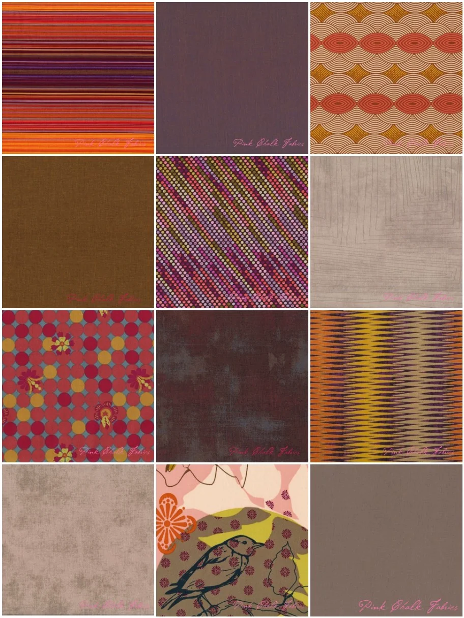
But I think it took one more thorough browsing of the Pink Chalk Fabric site to find my rhythm and bring together a palette that is so very much my taste. I'm an autumn baby, with the autumn complexion and color tastes, and these dusky, earthy tones make my heart sing. Even though I will profess until my breath runs out that I do not like purple, the plum and burgundy hues have been creeping more and more into my artwork and my wardrobe. Just sayin'.
So those of you with a fabric obsession who enjoy putting stacks together just for the sake of the exercise should visit Rachel's blog and get in on the fun. And for those of you who find inspiration in color and other people's interpretations on the same theme, there are some amazing mosaics already linked at the bottom of the post! One could spend hours just taking in the eye candy.


