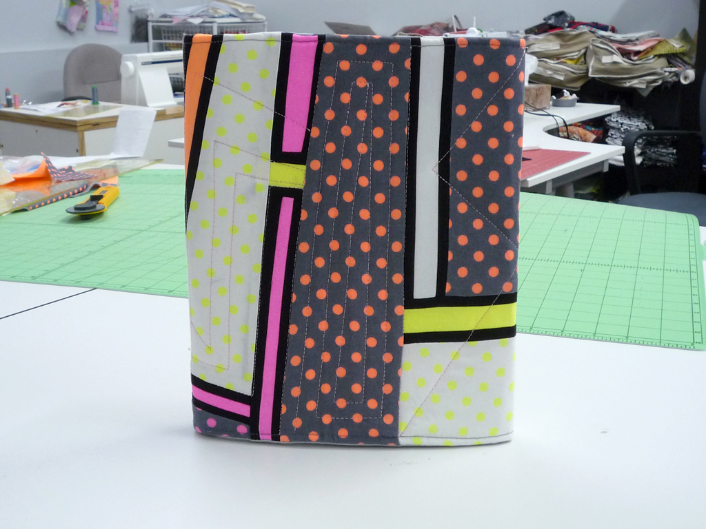
Is it wrong to be channeling my '80s pre-teen and teen years while making an iPad cover? Back in a time when Atari and Apple II were the height of consumer electronics and Cyndi Lauper, Boy George and George Clinton all had hair in these colors? (Okay, so George Clinton's hair doesn't narrow down the decade, but you all get my drift, right?)
Michael Miller Fabrics is joining with Portland Modern Quilt Guild to do another challenge, akin to the Cotton Couture block challenge from last year. This year it's to introduce their new (or upcoming?) neon fabric line. And WOW! These guys are true to their word... especially that yellow, just seems like it could be bottled up and set in a window to attract visitors!
the initial swag
Each of the due-paying members of PMQG who wished was generously given a stack of 10 fat eighths with which to work, combining both the new neons and a few neutral solids from MM's cotton couture line. We were asked to either make a quilt block to be judged and potentially included in a group quilt for future display as a Michael Miller promo, or we could opt to make an accessory or item, as long as it incorporates both patchwork/piecing and some quilting.
I thought about what I might make for just a couple of days. For some reason making a quilt block just didn't appeal to me - I knew I wanted to come up with a thing to make. But what? I don't know why the iPad cover hit me, but it seemed like a good way to use these fun fabrics in a self-contained project that I might actually USE.
I started by mapping out general dimensions and thankfully was able to put this together without buying ANY extra supplies... well, that's not quite true, unless I want to use ugly beige velcro as the closure I do need to buy a cute button and some round elastic or something. Details, details. I had just about 1/3 yard of Timtex on hand, and as I was going through the process I would probably have preferred Craft-Fuse, but this worked just fine with a little basting around the edges along with the "back" and the fleece or batting all sandwiched.
As for the design, I knew I wanted to go more or less improv style with the bolder fabrics slashing across the grey polka dots. I had to mix it up a little bit to make sure the fat eighths would last. I'm glad I was working within that constraint, because I am really happy with what came out of it!
And on the "inside" I went simpler, since 1/3 of it would be covered by the device anyhow, but still had fun playing around. And I actually think I'll be glad I chose to use the orange for behind the iPad... it's not blinding, nor is it such a contrast to mess with the light or reflections near the screen.
One of the biggest challenges was doing the outside edge joining all of the layers, plus the elastic strips and then flipping it right side out with that long piece of Timtex inside. I had to just bite my lip, smoosh it up and force it through the opening in the hopes that I didn't mess up its stabilizing effect.
As you can see, it definitely got a little distorted in the process, but not to fear! Once I flattened out those outside seams and top stitched around the edges it was apparent that with the addition of the quilting I'd have a flat, secure cover. At least I was keeping my fingers crossed that that would be the case! My test run...
So on with the quilting!
I knew I wanted to try something geometric and graphic that would not necessarily follow the improv piecing but emulate some of the shapes and designs from that decade of my youth. Hope I did justice to that idea.
And all together...
I have to admit, I am actually much happier with the outcome than I ever thought I would be. I may actually carry this thing around with me and be proud! How could I have just skimmed this trend back in the day only to be pulled into it at this age?!? I'm craving my earth tones now, let me tell you!


